Your Guide to Different Planner Layouts Types
Daily Planner Layout
A daily layout is exactly what it sounds like: A planner where each day gets its own page. While in older, datebook-style agendas, this was a go-to format, it has fallen out of favor in more modern planners and can be hard to find.
Daily layouts are ideal if you’re looking for a daily writing practice – for example, a lot of planner people use daily pages as a way to journal a little bit every day, or for memory keeping. If you use your planner as a project/task management planner, a daily layout may be the easiest to modify to suit your needs.
Pictured above is a daily layout planner from Ivory Paper Co., with space for a daily task list, meal planning, and any appointments or events you might have that day!
Personally, I’ve never used a daily layout in a regular planner.
I prefer blank notebooks for more involved writing, and I don’t have enough to plan in each day to justify one whole page per day!
I also like to keep an entire year in my planner at once, and with one page per day that can be a bulky planner – meaning more expensive to ship if you’re buying online (although many daily planners will contain 6 month’s worth at a time, keeping the planner itself slim).
That’s not to say that a daily layout can’t be perfect for you, however!
[cboxarea id=”cbox-M35BRbxy02HKR1KJ”]
Pros:
-best choice if you want to incorporate journaling or memory keeping in your planner
– tons of space for every day
– simple planner organization – one page per day is about as simplified a planner system gets!
Cons:
– Makes your planner bulky (and likely therefore more expensive to ship, or if you need more than one planner per year)
– May not be an efficient use of time/space depending on how you use your planner.
A daily layout planner would be excellent for you if:
– You want to include your thoughts, art, musings, other journaling in your planning process;
– You’re tracking and planning for multiple goals at once, and want dedicated daily space for each;
– You’re using your planner for literally EVERYTHING in your life and need room for daily appointments, schedules, quotes, meal plans, fitness trackers, reminders, literally everything you could ever possibly want.
– You have spare time every single day you want to use planning

Weekly Spreads
Weekly spreads are the most common form of planner layout you’ll find today.
Typically you’ll see a week on two pages, which is a spread where the days of the week are split across two pages so that when you have your planner laying open in front of you, you see the whole week at once.
Since the week is made up of an uneven number of days, some planners do this by squashing Saturday and Sunday together in one section (or shrinking each of those days to take up a 1/2 of the space).
Some planners prefer to have a notes section at the start of the week, so that each page contains the same amount of “boxes”.
Whichever you prefer depends on how much planning you need to do for the weekend – I personally like to leave the weekend “unplanned”, and just spend that time with my family doing whatever we want.
If you’re typically busy through the weekend, though, you might prefer each day be given equal space in your planner spread.
(I’ll talk about week on one page layouts a little father down, but the vertical and horizontal layouts that follow are typically week on two page layouts.)
Within the week-on-two-pages category, you still have different design layouts:
Vertical Boxes
Popularized by the Erin Condren Life Planner, vertical boxes divide the pages into equally sized columns for each day, with each column usually (but not always) divided into three sections for each day.
The vertical layout took a little getting used to for me, but I got the hang of it fairly quickly.
Having three boxes for each day might look more complicated at first, but it’s actually much easier to organize.
If you have multiple things you’d like to plan for in a day, having the days pre-divided can make that SO much easier.
When I used a vertical layout, I put important work stuff in the top box, household to-dos in the middle, and used the bottom to keep track of dinner plans, fitness and water intake, anything that I wanted to track daily.
Most hourly planners also use vertical columns, but I’ll cover those in their own section!
Pros of a vertical layout:
– Already divided boxes
– Very easy to decorate (The MAMBI box stickers are designed to fit Happy Planner boxes perfectly, and you can easily find sticker kits on Etsy designed for the HP and EC boxes)
– Allows you to track or plan multiple things per day
Cons of a vertical layout:
– Less space to write, you’ll need short, simple bullet points
– Not an efficient use of space if you AREN’T using your planner for multiple things
– Harder to fit in a smaller planner – if you prefer an A5 or Mini size planner, vertical might not be the best choice.
A vertical layout would be perfect for you if:
– You use your planner for your whole life
– You have multiple things to keep track of
– You want a common layout so it’s easy to find beautiful stickers and decorations that fit perfectly
Horizontal Boxes
Horizontal layouts are more old-school – if you had an agenda back in school, it likely used horizontal boxes, which spread across the width of the page and stack the days on top of each other.
For the longest time, I felt like horizontal boxes were passé, not useful, and I avoided planners with them.
This year, however, I’ve found that I much prefer to be able to write in a wider box, and I enjoy (what I feel is) a more efficient use of space.
I’ve gone back to a horizontal spread for my work planner, and I’ve fallen in love with this style all over again!
Pros of horizontal days:
– More space to write – especially if you prefer sentences to bullet points;
– Less complicated layout
– Easier to divide the space yourself, based on your needs
Cons:
– Days are all one space, instead of being divided for you
– This can make it difficult to track or plan multiple things each day (but not impossible)
A horizontal layout would be perfect for you if:
– You are looking for a simpler planner but still want a week on two pages
– You’re using this planner for only one or two things (i.e, a work planner or a fitness planner) instead of for your whole life
Week on One Page
Week-on-one page is one layout that I think is starting to make a comeback lately – I’ve been seeing more of them offered for sale, and more people using them.
There’s two different ways a planner will display a week on one page layout.
The first is to have each page showcase a week, with the page evenly divided by day.
This way, if you have your planner laying open flat, you’re looking at two weeks at once.
This can be great if you have an ongoing journey that you’re tracking in your planner – I’ve seen this used well for a fitness planner, for example.
The other way (which I prefer) is to have the days of the week on one page, and the other page divided into notes sections, trackers, or weekly lists – whatever you might need to fit into that week, but not necessarily assign to a specific day.
This layout really interests me because it looks like it would be great for project management – I’m thinking I’ll try this out for my blog planner next year!
If you’re looking for an interesting week on one page layout, the Happy Planner refers to it as “dashboard style”. Cute!
Pros of having a week on one page:
– Leaves room for tasks and notes that aren’t day-specific (if using dashboard style)
– Lets you see two weeks at a time (if using a two weeks per spread style)
– More efficient use of space if you don’t need to write a lot per day
Cons:
– Less space per day, so not a lot of room to write
– I could see a two-week spread getting cramped or disorganized
– Dashboard style might not work for you if you prefer to divide your to do list by day
Week on one page layouts would be perfect for you if:
– You want to use your planner for project management (dashboard style)
– You use your planner for one specific thing (fitness, meal planning, etc)
– You want to economize and fit two weeks on each spread
Hourly Layout
An hourly layout can show up either as a day on one page, or in a weekly spread, but it’s almost always a vertical layout. This is because an hourly layout divides the day into sections based on time.
I personally haven’t ever used an hourly layout, but I’m tempted to try it.
It would make time-blocking much easier, for one! An hourly layout is useful if you have lots of things scheduled, such as meetings and appointments, or if your schedule changes day-to-day.
I saw one woman in my planner group say she couldn’t imagine using any other layout – she’s a real estate agent, and has client appointments and viewings booked at different times each day, as well as phone appointments and essential to-do list items she needs to fit in between.
That seems to me like a layout match made in heaven!
Pros of hourly planner layouts:
– Able to keep track of many time-sensitive appointments or events
– Excellent for time-blocking
– Easy to see at a glance exactly *when* something needs to happen
Cons of hourly planner layouts:
– May feel restrictive if you’re planning for things that don’t *need* to happen at a specific time (i.e, getting laundry done on Wednesday or a reminder to call your mom)
– You might have a hard time finding an hourly that marks time the way you need it; for example, the planner may start at 6 a.m. and run until 8, but you regularly work til 9 and wake up at 8.
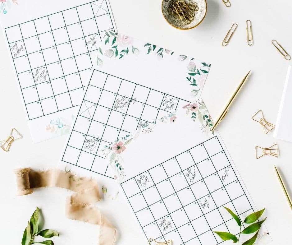
Monthly
A true monthly layout planner can be harder to find, and to be honest, I had a hard time finding one to link you to here!
A monthly planner is pretty much a planner that’s made entirely up of the monthly calendar pages – no weekly spread, or dedicated day pages.
I did end up finding one at, believe it or not, the dollar store. I think because people who usually buy planners are looking for more space than just monthly pages, dedicated planner companies don’t bother creating planners with only monthly pages.
Typically, if you only need monthly pages, you might have more luck finding what’s called a “desk calendar”, which is the same thing as a wall calendar but designed to lay flat open on your desk (did anyone else have a teacher in school whose entire desk top was covered by a calendar? I just got a flashback to high school science!)
A monthly can be great if you only need to track things like doctor’s appointments or bill payments and don’t need a planner for anything else – especially since it seems the family wall calendar has gone out of style these days.
Pros:
– Great if you only want a bare-bones datebook with no funny business
– Efficient use of space with no wasted spreads
– Can fit an entire year or 18-month calendar in a very slim notebook
– All the benefits of a wall calendar without taking up wall space
Cons:
– Typically harder to find than more involved planners
– Much less space to write information; probably not useful for daily tasks
– Most planners already have monthly pages alongside weekly or daily spreads, so you’re getting 1/3 of a planner and probably not paying 1/3 of the price!
Your Guide to Different Planner Layouts Types
With so many planner layouts to choose from, there’s truly something for everyone – and for every planning style.
Choosing your planner layouts can seem frustrating, but once you find one that works for you – a planner can be the most important item you own!
Looking for some more planner supplies or layout tips?
Check out our best posts:
- Your Guide to Planner Layouts
- Where I Find Great Planner Supplies Easily
- Best Planner Accessories You Can Find on Amazon
- Your Yearly Planner: A Guide to Choosing the Best Planner for You
our quick course on time management!
Pin it on Pinterest:


